Al a Carte Ecommerce Design
Your website needs a constant look and feel, which helps your customers know they're still on the same website as they navigate from page to page. Our templates include a header, left navigation, and footer section. Learn More!
Guide your visitors to where you want them to go with an appealing, friendly presentation that increases your sales and reduces your bounce rates. Learn More!
Think of any major company you know and see if you can remember their logo. Every company has a unique logo, which identifies them and their core values, vision, or mission. Your logo needs to do the same thing. Learn More!
Your logo brand kit includes the original Adobe Illustrator file for your logo, #10 business envelope layout, letterhead, favicon, and business card layout. Learn More!
Engage your visitors stronger with graphic form buttons. Properly designed graphic buttons convert your shoppers into customer far better than standard gray form buttons. Learn More!
Use the H1 Backgrounds to notify your visitor of the page topic and highlight your initial call to action on the webpage. Making your H1 heading tags stand out increases your customer's awareness. Learn More!
A graphic heading for your 10 of your categories. Each category graphic is 90px tall and the width of your content area. Learn More!
The most critical webpage in your website excluding the checkout page is your product page. This page provides all the important information your shopper needs to decide to add a product to his or her cart. Give her the confidence she needs in your business. Learn More!
Presenting a shopper's cart in an appealing manner has led to increased sales. Heighten your shopper's confidence with pizzazz. Learn More!
Your checkout page needs to be simple and easy to understand. Too much distraction leads customers to leave without completing the purchase. Increase your sales with a simple, easy to follow checkout page presentation. Learn More!
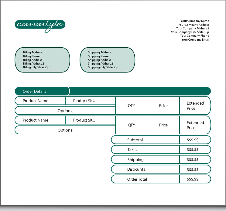
Reassuring customers immediately after they complete a purchase helps reduce canceled orders and chargebacks. Boost your customers' confidence with instilling imagery. Learn More!
Add a slideshow to your homepage and present specific offers through the images as they change. Your homepage slideshow can have up to five images. Learn More!
Creating forms can be challenging. As such, Ascender offers contact us page development to help you with that daunting task. While we're at it, we'll develop a header graphic for your contact us page.
Learn More!
404, 403, and 500 error notices tend to reflect an unfriendly atmosphere and tell visitors you don't care about them. Recapture them with a friendly notice and appealing banner that lets them know you do care. Learn More!
Your blog can drive more then 50% of your website's traffic. Presenting an enjoyable and professional atmosphere helps get your blog off to a great first impression. Learn More!
Engage your Twitter followers with exciting graphics that give your business the best first impression possible. If you need a Twitter account, we can set it up for you and get you started. Learn More!
Facebook gives your business to engage with your followers in a way no other solution provides. Excite your followers with an energetic design and presentation. Learn More!
According to Jupiter Media, Forrester, and others email still generates the majority of converting visitors. Presenting your sales and promotions in a way that appeals to your customers helps build your brand and maintains your customers' confidence in your business. You will receive an initial template, which you can use on your own in the future. Additionally, you'll receive documentation on how to add your images and their dimensions. Learn More!


